Yahoo Borrows Microsoft’s Blade Interface

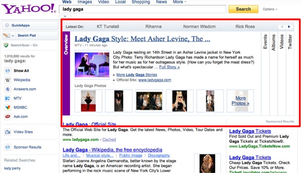
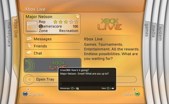
Yahoo is toying with the idea of adding a “blade” (or more commonly known as a horizontal accordion) interface to some of it’s search results. The blade interface’s claim to fame was its use in the original Xbox 360 dashboard (2005-2008).  I’m not confident this feature will last very long. Microsoft moved away from it with subsequent dashboard updates for the Xbox 360. Maybe Yahoo will have better luck.

Journalism In The Age Of Data

As data is becoming a medium itself, journalists need to figure out how to tell a story with overwhelming data. This 50 minute documentary explores data visualization as a storytelling medium.

The full version with annotations and links is available at datajournalism.stanford.edu.

Summary Of An Event Apart DC Day 1

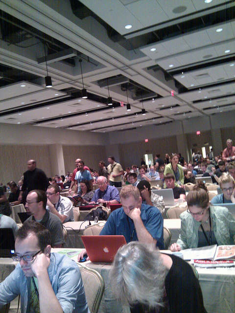
The Event Apart conference series is the top-notch gathering for people who make websites. Making its way across various cities in the U.S., the Event Apart tour stopped in Washington, D.C., which I was fortunate enough to attend. The speakers themselves were amazing but interacting with the attendees in real-time during the talks opened a whole new level to the experience. Below are some of the best tweets I curated from each of the sessions. All of which came from afeedapart.com, the official feed aggregator for An Event Apart.

Web 2.1: The Medium Comes of Age by Jeffery Zeldman

Zeldman started things off with a presentation covering the history of communication from the printing press to HTML5, and everything in between. In 2010, standards based design is no longer fringe, HTML5/CSS3 are viable technologies, and the mobile web is taking shape.

  • The death of the web is greatly exaggerated. @tomkruk
  • If the web is dead, then print must be mummified. @Merlaak
  • “There are 241 newsgroups on 1986. 240 are porn…” @grum_dot_com
  • Zeldman calls the telegraph The Victorian Internet @eduiconf
  • R. Cailliau – leading man’s best friend. Worked with Tim Berners-Lee to invent the web. @mad_sunshine
  • 1991 AOL… remember 9600 baud modem? = yuck @lavinia
  • “there’s a history of the internet being ugly and being designed by people who can’t design their way out of a paper bag” @ashleyjoost
  • 1993. Mosaic. We’ve come a long way. #aea http://yfrog.com/jcem8mj @eTapWeb
  • I remember using MOSAIC on my Amiga 500, wondering why “forms” are not showing… @tomkruk
  • And you had to PAY for Netscape @cityrider49
  • Netscape Gold FTW! @tomkruk
  • Zeldman breaking down landmark moments in web history: “1995 brings us the tiled background” @mattmediadc
  • “IE no longer sucks, IE is awesome” – Zeldman, #aea … hear it from the man! @franksedivy
  • 1998 — internet traffic doubles every 100 days @ashleyjoost
  • the phrase “best viewed…” should be left to history @cityrider49
  • dot com bust = coming off a coke bender @tonyvia
  • 2000 dot com bubble burst brought us benefits: people were forced to learn standards, improve their skills to make a difference. @mihswat
  • The CSS Zen Garden changed my professional career… Design for the web became a whole different concept @mattmediadc
  • “you can’t burn every house down because we have this new idea for architecture” @TheTroz
  • XHTML 2.0 was burning every house in the world just to propose a new architecture. @mihswat
  • “HTML5. You keep using that word. I do not think it means what you think it means.” @eTapWeb

Object Oriented CSS by Nicole Sullivan

Nicole developed a technique for managing CSS called Object Oriented CSS. The basic premise is to recognize visual patterns and mark them up consistently. Consistent markup results in more compact and efficient CSS code to style which in turn results in more manageable code and faster performing websites.

  • If you write CSS for any site of significant size or traffic you MUST hear @stubbornella talk on OOCSS. This is my second time listen. @aebsr
  • Reason for CSS optimization, CSS Blocks progressive rendering @eduiconf
  • 42% of Alexa’s Top 1000 don’t gzip CSS. 44% have more than 2 files. 56% serve with cookies. 62% don’t minify. 21% have > 100k of CSS. @mihswat
  • “Our sites are choking on the amount of CSS we’re throwing over the wire.” @eTapWeb
  • OOCSS makes me intellectually erect @grum_dot_com
  • Object oriented CSS sound a lot more complicated than it really is. @kingkool68
  • wow around May 2009 FaceBook had over 700 CSS files that totaled more than 1.9Mb @160mph
  • “If you fighting your CSS, your architecture failed” @franksedivy
  • Facebook has all of their headings bold. Non-bolded headings looked weird to users. @kingkool68
  • People aren’t viewing your home page or reading your about section anymore. It’s all Google hit-and-runs, and it’s changing our design. @brian_klaas
  • Css objects were better for humungo sites like Facebook. Seems overkill for smaller, simple sites. @kingkool68
  • Dust-me Selectors to find unused css. http://www.sitepoint.com/dustmeselectors/ @chrismjones
  • A ‘giant pink heading’ should not become a ‘small blue heading’ when placed in another part of the site. @phej
  • Elements should be styled globally, avoiding area-dependent declarations in CSS. Rules should be predictable, avoid overwriting them. @mihswat
  • Love how @stubbornella uses the story of the lady who swallowed a fly in relation to CSS @candiRSX
  • Writing CSS to correct previous bad CSS is the legacy of the old woman who swallowed a fly. It makes sense when @stubbornella says it. @achellios
  • Nicole Sullivan’s Grids on github – http://wiki.github.com/stubbornella/oocss/grids @Merlaak
  • Classing elements with element names (“.h1”) is one step removed from or similar. @jgarber
  • hmmmm…not sure about @stubbornella rec. on eg h3.h6 Isn’t that sort of hacky? Shouldn’t we re-examine design first? @ryanhoonlaverty
  • Among Alexa’s Top 1000, there’s a site with 511 declarations setting styles for h1-h6. Facebook used to have 958. @mihswat
  • After a CSS rewrite, there were only 25 declarations. @mihswat
  • Amen to the underscore hack. I use it all the time. @kingkool68
  • Avoid styling IDs. IDs are for JavaScript. @mihswat
  • styling IDs messes up specificity @eduiconf
  • “You should definitely suffer if you use hacks” @chrismjones
  • Not sure about this ‘not styling IDs’ and have class driven styles .that on top of the things aren’t semantic (.h1, .h2 etc…) … :/ @franksedivy
  • “AVOID !IMPORTANT – except on leaf nodes” Good advice!! @JudyBad
  • “I try to get specificity out-of-the-way so my cascade can really shine.” @andysherry
  • agree with not using !important, disagree with not styling IDs. style IDs if they’re used sparingly or if “lead nodes”. @courcelan
  • Styling using IDs, !importants, and too many nested elements is like fighting whose CSS rules are going to win. @mihswat
  • who knew? the way I wrote CSS as a n00b was on the right path – lots of class selectors and few element/ID selectors! @raelehman
  • I think OO CSS takes the art and craft away from CSS and gets it ready for consumers world! :( @franksedivy
  • The blinking cursor says, “You don’t remember anything.” (Referring to the command line) @Merlaak
  • Find and replace is really why I use Dreamweaver as my coding tool of choice. No need to figure out grep. @kingkool68
  • See how many times a declaration if when your css from command line. grep -r font-size . | wc -l @chrismjones
  • Hmm, @stubbornella‘s OO approach to CSS preso has some good QA tricks, but her philosophy has too much scaffolding for general use @talbs
  • Feeling a little weird about @stubbornella‘s approach to object-oriented CSS, but liking some ideas about finding duplication. @graphicsgirl
  • OOCSS sounds like the best approach for Facebook, but not most sites we design and build. @graphicsgirl
  • afraid newbs will get the wrong idea with @stubbornella‘s methodology and not consider scale/context/semantics @talbs
  • I found taking the general idea from this presentation and building a custom framework for our approach to build sites worked great @aeaattendee
  • Looking at CSS in a way I never have thanks to @stubbornella @TheTroz
  • Facebook reduced CSS size by 19% and HTML size by 44% after optimizations @mihswat
  • * and _ hacks > conditional statements @160mph
  • Been using OOCSS for the past year and a half. Have never found a site that did not benefit. @chrismjones

The CSS3 Experience by Dan Cederholm

Dan emphasizes that sites don’t need to look and behave exactly the same in every browser. Case in point, he owns http://dowebsitesneedtolookexactlythesameineverybrowser.com/ and http://dowebsitesneedtobeexperiencedexactlythesameineverybrowser.com/. CSS3 is available in modern browsers today and suitable for non-critical elements of a design. His presentation consisted of several demos showcasing how CSS3 could be used to sweeten interfaces.

Mobile First! by Luke Wroblewski

Luke covered designing Web applications for mobile platforms first before the desktop. This helps you focus a website down to its bare essentials and functionality. The mobile web is exploding, and in some cases, is the only access someone has to the Internet.

  • “Web products should be designed for mobile first, even if no mobile version is planned.” @eTapWeb
  • desktop internet devices: 1 billion, mobile devices: 10 billion @tonyvia
  • “50% of people who were new to the web last year were on mobile devices.” @eTapWeb
  • Why build mobile first? More growth and future users. @tyrale
  • Mobile Web growth has outpaced desktop Web growth 8x. Smartphone sales will pass PC sales in 2011. @mihswat
  • Mobile is the new black @JudyBad
  • Great mobile products are created never ported. @kingkool68
  • mobile stats from #lukew http://lukew.com/ff/ @eduiconf
  • “27% of searches on Yelp! come from 4% of users (i.e. the users who access Yelp! via iPhone.)” @zeldman
  • “Designing for mobile forces you to focus and prioritize.” @eTapWeb
  • Moving from desktop to mobile… First remove 80% of the crap @tyrale
  • Design for mobile first and you will get down to the things that matter. @mad_sunshine
  • “everything else on this page needs to pixelate and die.” @courcelan
  • Mobile devices’ limited screen size makes you focus on what’s important – main features, straight communication. @mihswat
  • Use vector to design for the web, build with css3 it will scale automagically! @tyrale
  • Mobile design is all about adaption @kingkool68
  • for mobile, make the content the UI @rkunboxed
  • 100ms delay results in 1% sales loss for Amazon ($191 Million) @eduiconf
  • Google says 500ms delay drops search traffic by 20%. Wonder what our 8,000ms server hangs do. Cough. @itmaybejj
  • optimize for mobile:speed eg, eliminate redirects & use app cache for local content storage @dinalew
  • Mobile is quick bursts, and mostly at home on usage. @tyrale
  • Your mobile is with you all the time, so designing for mobile means designing something that can be used all the time. @zeldman
  • Only make content and web apps that are useful to people *all the time @halvorson
  • People spend only about 2 to 4 seconds on a webpage using a mobile device. Optimize your site for this behavior. @mihswat
  • design = constraining until an elegant solution presents itself @lavinia
  • Many users will interact with mobile devices using one hand and one thumb (one-handed touch), so the UI has to be simple. @jessicaivins
  • 1 million per day = touch based phone purchase @lavinia
  • mobile: must accommodate “french fry fingers” @JudyBad
  • wow. ‘1.1 billion consumers with Nokia devices in 2009’ @westerndave
  • 8-10mm = average human finger pad , so design for 9mm touch area @lavinia
  • touch me = Touch Gesture Reference Guide http://www.lukew.com/ff/entry.asp?1071 @westerndave
  • Hovers are not intentional, clicks are @eduiconf
  • great stat: People spend only about 2 to 4 seconds on a webpage using a mobile device. Optimize your site for this behavior. @lavinia
  • Hovers are not intentional. Just because a user’s mouse has paused somewhere doesn’t mean they expect to see a menu. @zeldman
  • most devices use wifi for location (gps is narly indoors) @lavinia
  • Yes! Hover cannot be considered an intentional interaction on a mobile device. I activate them accidentally on my *desktop*. @kissane
  • Yelp’s augmented reality feature boosted their sustained traffic by 40 to 50 percent @mihswat
  • Wonderful presentation from Luke Wroblewski. This really jives with a lot of stuff that get talked about in IxD these days. @iwilsonjr

Message and Medium: Better Content by Design by Kristina Halvorson

Kristina sure knows how to develop a killer content strategy. A website’s message carries through to other places on the web than just the main website. Customer support, social media, and meta data should all echo the tone of the main message. And there is a lot more to a good content strategy than determining what text goes on the front page. How will this content be produced? Who will update it? How often will we add new content?

  • Kristina Halvorson (@halvorson) asked us to sing Happy Birthday to her son. How sweet… @shiota
  • @halvorson on two of my favorite topics: teeth & content strategy! @dinalew
  • haha. User-scented content. “Smells like user.” @ryanhoonlaverty
  • Content strategy plans for the creation, delivery, and governance of content that people care about. @eTapWeb
  • website content: stop talking about what you do and talk about what your users want. hello user-centered content @dinalew
  • content requirements ≠ content strategy @tonyvia
  • content strategy = content (substance + structure) & people (workflow + governance) @tonyvia
  • messaging is not a mission statement, brand promise or tagline @eduiconf
  • nobody cares about your mission statement [so true!] @tonyvia
  • First second visiting a website is an emotional response @kingkool68
  • user forms an impression of your site in ONE SECOND (load time + design) & decides to trust you or not within 10 seconds @tonyvia
  • In 1 second user should have an emotional response. 10 seconds, understand your primary message. 2 minutes, secondary msg. @eTapWeb
  • Reminded of how some of the traditional #ux roles/deliverables can suffocate copywriters’ creativity/skills. Preach on, @havlorson. @talbs
  • Include maintenance requirements for key pages – great content strategy idea @graphicsgirl
  • Consistency inspires trust in your readers. @JudyBad
  • consistency inspires trust in your readers @lavinia
  • Visiting every page of your site with its main message in mind helps to see if you’re communicating it the right way with consistency @mihswat
  • #aea is really driving home the importance to collaboration across roles/disciplines to tackle those important grey areas of an experience! @talbs
  • And your FAQ page is inconsistent. Where’s the fun, Ben & Jerry? @mad_sunshine
  • pet peeve: “contact us” page hiding phone/address 10 layers deep. after all, that’s all we want from “contact us” page 99% of the time @sarahdippity
  • Workflow and governance are crucial for good content strategy. @kingkool68
  • “whats our facebook strategy?” “that depends… what are you trying to do, who’s going to do [keep up with it]?” hear, hear. @courcelan
  • What is your social media strategy? Is it successfully delivering your message? Or do you have a Twitter just for the sake of it? @mihswat
  • Page descriptions. Tweets. Facebook posts. Google results. Your message should be consistently delivered everywhere. @mihswat
  • @halvorson‘s talks on content strategy are ALWAYS timely and poignant. Maybe because content strategy is a never-ending struggle… @ryanhoonlaverty

Anatomy of a Design Decision by Jared Spool

Jared pointed out that every site on the web came to be from a series of decisions. He has identified 5 styles to design decisions and when each style might be appropriate for a given project. Oh and university homepages feature images of girls under trees way too much.

  • Seen it before, but it’s easy to forget just how awesome http://havenworks.com/ is… @davidocoulter
  • “it validates” – Jared Spool (sarcastically referring to havenworks.com) @SethBlanchard
  • “Someone actually designed this on purpose. This way.” – @jmspool on a particularly egregious web design specimen. @alykat
  • Sites like havenworks.com or arngren.net went over design decisions. Now that’s something to think about. @shiota
  • Jared is talking about the famous 37signals vs. Donald Norman “celebrity deathmatch”. @shiota
  • “Self design works great when you’re designing something for your own use, or for use by people just like you.” @eTapWeb
  • Crappy and unhelpful error messages are the perfect way to frustrate your user. @shiota
  • Unintentional design happens on its own. Works great if user will put up with whatever or we don’t care about support costs. @eTapWeb
  • Airline websites: helping AEA speakers make their point since 2005 @ryanhoonlaverty
  • “Genius design: when we’ve previously learned what users need. We’re solving the same problems repeatedly.” @eTapWeb
  • “Activity Focused Design: designing for new activities unfamiliar to us.” @eTapWeb
  • Well @jmspool‘s talk includes a reference to @lingscars‘ website www.lingscars.com… and well, just check it out. @hellogeri
  • Jared is comparing Six Flags map to Disney World’s map. Both amusement parks, yet totally different maps. Each with its own focus. @mihswat
  • Disney. Someone has thought about what happens between the rides. Thinking about the experience. @mad_sunshine
  • experience is the stuff that happens around usage. @lavinia
  • “User experience is what happens in between activities” @simplebits
  • University website traps — girl under trees. WOW! So many of them… @mad_sunshine
  • OMG I can’t search – the search box is on the left [side]! @raelehman
  • Rule #17: Always put the search box in the upper right @grum_dot_com
  • Hmm. design style guides and guidelines never work. @mad_sunshine
  • Informed Decisions > Rule-based Decisions @160mph
  • Rule-based decisions prevent thinking. Informed decisions require thinking. @sarahdippity
  • Design is about the exception cases. If everything was always the same, we would not be interested in this work. @beep
  • Instead of spreading dogmas/methodologies, try spreading tricks/techniques. People will learn, think, and won’t struggle with rules @mihswat

Dark Design Patterns

Those same design patterns that designers use to make things easy for visitors can be flipped around to trick visitors resulting in profits for the companies that employ them. Harry Brignull goes over some of these “Dark Patterns” in his talk at UX Brighton 2010. He also runs the site darkpatterns.org to catalog various common types of Dark Pattern, and to name and shame organizations that use them.

(via Engadget)

Where Good Ideas Come From

(via The Attention Management Blog)

WordCamp Mid-Atlantic

This past weekend I got to attend WordCamp Mid-Atlantic, my first WordCamp ever. This years conference took place at Johns Hopkins University in Baltimore City. The venue was a little tricky to get to and the parking situation was a bit limited, but once I got there I had a great time. The place was packed with all kinds of different people who shared one common interest — they all love WordPress.

The camp was divided into two tracks; beginner and pro. I spent the whole day in the pro track and my summary of the talks are below.

Scott Kingsley Clark – WordPress as a CMS


Scott Kingsley Clark led off the first session of the pro track with WordPress as a CMS. His talk covered how to add more fields to the edit screen besides the usual title, post, tags, and categories we’re all used to seeing. He walked through using a plugin called Pods CMS, which he is a co-author of. To me, it seems a little over complicated. I like to use custom meta fields to extend the data contained in posts or pages. For a non-technical user who isn’t comfortable writing PHP, Pods CMS seems like an acceptable solution to get them up and running.

Brad Williams – WordPress Security
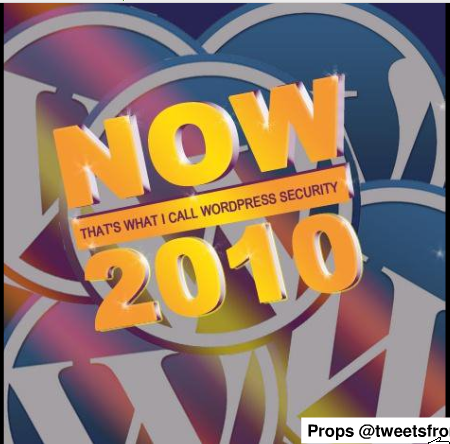

I’ve listened to Brad many times as a regular on the SitePoint podcast so it was good to actually meet him in person. His talk (slides available) on WordPress security was well attended as securing a WordPress install is applicable to every blogger. The tips Brad dished out would help anyone lock down their blog with such methods as checking your file permissions, deleting the admin user, changing the prefix on your database tables, and (most importantly) staying up to date with plugins and core updates.

At the end of his talk he mentioned a list of plugins to help with WordPress security.

  • WP Security Scan – Scans your WordPress installation for security vulnerabilities and suggests corrective actions.
  • WP-MalWatch – performs a security scan of your WordPress installation nightly looking for evidence of foul play and if WP-MalWatch finds it, a dashboard widget will tell you were you should take a closer look.
  • ServerBuddy – a plugin that tests server configuration to analyze the quality of your hosting & server configuration, and seek out problems with compatibility with various WordPress themes and plugins.
  • Exploit Scanner – searches the files on your website, and the posts and comments tables of your database for anything suspicious.
  • WordPress File Monitor – Monitor files under your WordPress installation for changes. When a change occurs, be notified via email.
  • Login Lockdown – records the IP address and timestamp of every failed login attempt. If more than a certain number of attempts are detected within a short period of time from the same IP range, then the login function is disabled for all requests from that range.

For lunch a group of us went across the street to Tambers, an indian burger place. Their burgers are perfectly normal but the last page of the menu had indian dishes. Weird. I also got a chance to meet Lokesh Dhakar, the author of the original lightbox script. He’s a smart guy.

Andrew Nacin – Undiscovered APIs

Photo by Nick Whitmoyer

After lunch, Andrew Nacin gave a talk (slides available) about functions and APIs that aren’t as well known about among developers. Since they aren’t well documented, the only way to learn about them is reading the source. I really got a kick out of his talk because I had been looking at some of these functions for a project of mine. Some neat functions include

  • wp_remote_request – to download files to your server from the web. WordPress uses this internally to download updates, themes, and plugins from within the admin screen.
  • wp_handle_sideload – lets you add a file to the media library that is already located somewhere else on your server.
  • oEmbed – allows the embedding of media by simply including the URL in a post. WordPress makes it easy to add your own oEmbed providers.
  • add_feed – lets you make your own feed. Andrew demonstrated how to make a JSON feed of your blog posts with just a few lines of code.

It is no wonder Andrew knows all of this stuff, he’s one of the seven core contributors for the WordPress project.

I liked in-depth technical talks like this. I was probably one of the few people who this didn’t go over their head.

Jacob Goldman – Customizing WordPress Admin

Photo by Nick Whitmoyer

Customizing the back-end admin screen of WordPress is a big selling-point for Jacob’s consulting business. He feels the admin screen should be as simplified and tailored to the clients need as possible. And contrary to what others might say, WordPress makes it simple to tweak the admin screens.

Much of what Jacob talked about was removing sections like menu items that aren’t used and the default widgets on the dashboard. He added his own custom widgets to the dashboard to point to a contact form if the clients need more help. Speaking of help, you can also customize the contextual help menu tab that appears on practically every page. Adding your own help text is a great way to avoid people asking you the same questions over and over. At the least, you can tell them to check the help tab on the page you have a question with. WordPress also lets you customize the look and feel by adding your own stylesheet and overriding the default styles.

Jacob’s talk was inspiring for cleaning up the backend. He put a sample theme file that you can copy and paste from into your own theme.

Jane Wells – Closing Keynote

Photo by Nick Whitmoyer

To wrap up WordCamp Mid-Atlantic, we had the opportunity to hear from the head user experience leader for WordPress, Jane Wells. The keynote was delivered over Skype… from within a moving car! The video was a little blocky, but given the circumstances it was easily forgiven. Some of Jane’s keynote was about the upcoming improvements to WordPress. But most of the talk was gossipy Gnu Public License cruft. It wasn’t that interesting to re-hash the same stuff every other blog was blabbering about a month ago.

So that was WordCamp Mid-Atlantic. A huge thanks goes out to Aaron Brazell for organizing the whole thing and all of the sponsors for making the event possible. I look forward to attending other WordCamps in the future and maybe even hosting a talk of my own.
Adding A WYSIWYG Editor To Your Wiki

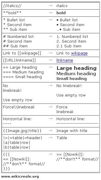
Wikis, like Wikipedia, are great tools for the creation and organization of content. The one thing that gets in the way however, is the special syntax needed to mark-up pages. Links are created by wrapping text in double brackets like [[ and ]]. Extra functionality can be expanded with different characters but honestly, it’s a lot to keep track of.

It’s hard enough formulating the words stuck in your head into a clear, well-written piece of content. Trying to translate your idea into cryptic wiki syntax is a brain-fart waiting to happen. For most folks introduced to an inter-office wiki, the syntax is the straw that breaks the camel’s back. You can kiss any chance of adoption goodbye when you explain that to bold text you need to have three single-quotes on each side of the text.

Thank goodness the MediaWiki+FCKeditor project is around. The goal is to build a usable WYSIWYG editor for the MediaWiki software (and they’re on the right track). Installing the extension is as simple as downloading a folder, copying it to your extensions directory, and adding a line to your localsettings.php file. Then presto, an easy to use interface that sits on top of the edit field translating hairy wiki-syntax to their visual equivalents. If your users can figure out how to use Microsoft Word, then they can understand the MediaWiki+FCKeditor extension. But fear not my die-hard wiki wranglers, the plugin lets you easily switch back and forth between the WYSIWYG editor and wiki syntax.

If you need to give it a try, check it out on this Sandbox page.

So adding one simple extension can make it easier for wiki-novices to get involved creating and editing content while staying out-of-the-way of the wiki-pros. If you need to get normal people involved with a wiki, make sure to add the MediaWiki+FCKeditor plugin to make life easier for everyone.

The Trials And Tribulations Of 10KB

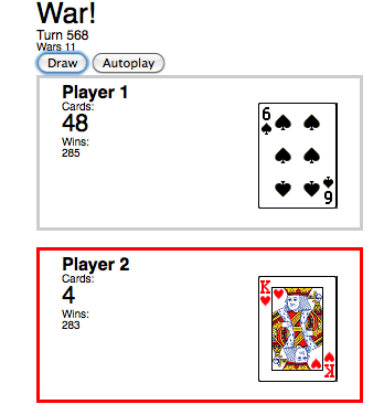
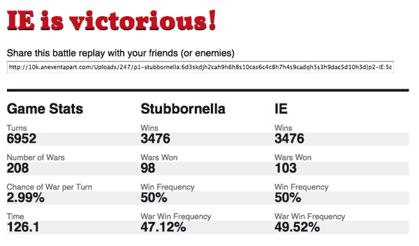
JavaScript is a fun language. It lets you build almost anything you can imagine. For some reason, I thought it would be fun to build a simulator for the card game War. I started hacking away on the idea in my spare time. It was also a good excuse to learn object-oriented JavaScript to make my card game simulator flexible and modular. After a few weekends I had something that worked (screenshot below). Unfortunately after that life got busy and my war simulator just sat there collecting virtual dust for more than a year.

Fast forward to July 29th when the 10K Apart contest is launched challenging developers to build compelling apps that are 10 kilobytes or less. This would be a fun way to refine my stale war game simulator as well as test my JavaScript coding-foo to squeeze it all in to 10 kilobytes.

Pure HTML Cards

One of my first challenges was re-doing the cards. Initially I constructed a single-image sprite containing all of the cards. JavaScript would manipulate the class of a div which would determine how to position the image for the proper card to be displayed. This method led me to discover something Internet Explorer actually gets right with CSS and the other browsers fall short. This image of all of the cards weighed in at 36KB alone. Ouch!

My solution was to use unicode characters for the different suites and letters and numbers for the card values. Child elements of the card held the symbols and I positioned them absolutely within the card element. The final touch was to rotate one of the child elements 180 degrees using the transform CSS property so it would display upside down just like a real card. My image-less approach was just a fraction of the size of using images for cards. But something was still missing.

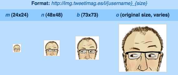
Playing cards have decorative designs in the middle. It would be too complicated to completely replicate these designs so I came up with the idea to use a Twitter avatar as a background. Thanks to the awesome service provided by http://tweetimag.es/ their RESTful api let me grab any public Twitter users avatar by constructing a simple URL. Browsers provide an easy way to  add new CSS rules to a stylesheet via JavaScript so I could dynamically change the background image of a card based on which Twitter names the user provided. This is where the idea for making my War game simulator revolve around Twitter users was born.

Viral Sharing

A bigger advantage to hooking into Twitter is it makes each game more personal for the player. Pitting two people in a card game battle makes the experience more meaningful then a bunch of plain, virtual playing cards flipping back and forth for a couple hundred of turns. This also has the potential for a viral aspect to my app since I already have atleast two Twitter names that would be interested in the results. In order to share a game I needed to create a way to read in the number of players, their twitter name, and their deck at the start of the game. Using a simple string of characters that represented this data attached to the end of the URL allowed me to do this. All of the values in the deck could be stored as a number or letter since I had unique first letters.

Card Encoded Equivalent
0, 1, 2 … 10 0, 1, 2 … 10
Jack j
Queen q
King k
Ace a
Hearts h
Diamonds d
Spades s
Clubs c

Therefore, the Ace of Spades could be represented as ‘as’, the 10 of Diamonds would be ’10d’ and so on. A full game looks like this: p1-kingkool68:adqhkc2d5d10s3h3d5hjs8dqc9c8h2s9d6c7c9skd10d8c7s7d2c4s|p2-naudebynature:jc6d10cjdkh5c4h6sqdks2has6h4d7h4cac10h9hah3s8s5s3cjhqs

A Heap of Data

One of my favorite parts of developing this app was creating a way for keeping track of all the different data that results from a single game. For each war I store the turn it occurred on as well as keep track of which player won the war. After each turn I store a copy of the players deck for further analysis after the game concludes. I originally wanted to include a line graph showing the number of cards a player had in their deck as the game progressed. Building that feature was pretty simple thanks to the Google Charts API but in the end it had to be cut in order to get below the 10KB limit.

Squeezing Down the Bits

I was a little ambitious with the functionality that when I was ready to start compressing my code down I was shocked to see my idea bloated to 33KB. That’s more than 3 times the maximum size. A serious slimming down was in order. Pre-populat lists of Twitter users that would make for interesting battles: cut. Charting capabilities mentioned earlier: gone. A brief blurb explaining the game and who I was: removed. Title tags: discarded. Every little bit I could trim down would help. After all this I was down to about 17KB and along way to go to get under 10KB.

Dean Edwards took JavaScript compression to another level with his /packer/ tool. He came up with away to reduce the size of JavaScript by removing white space, stripping comments, and replacing variables with shorter, less-coherent replacements. CleanCSS.com does pretty much the same thing but for CSS. Such optimizations include replacing font-weight:bold; with font-weight:700; color:#ff0000; with color:red; and so forth. These packing tricks helped get me to 13KB but I was running out of ways to optimize further.

My next plan was to modify my HTML. IDs like ‘prepare-for-war’ became a single letter, <strong> elements were replaced with deprecated <b> tags, and the closing </body> and </html> tags were axed since they had no affect on my page. Sidenote: Google chops off the closing </body> and </html> tags which for a site that serves up that volume of pages results in a savings of a couple million dollars in bandwidth bills every year.</end sidenote>

At this point I was so close to coming under 10KB but yet so far. It was time for one more drastic technique. I noticed how well the JavaScript /packer/ tool worked so I decided to combine my HTML and CSS into a single line and use JavaScript to write it out to the page as it was loading. This way I could combine it with my main JavaScript code for the most efficient compression possible. After 3 hours of toiling in vain, I reached the point where my app was under the magic limit. Ten kilobytes is equal to 10,240 bytes. My code weighed in at 10,236 bytes; a mere 4 bytes to spare!

Lessons Learned

Even after spending hours tediously compressing and optimizing my code, I still had a lot of fun. My biggest challenge wasn’t squeezing everything down, or getting it all to work just right. Rather my biggest challenge was myself and when to determine it was finished. After each piece of functionality I coded I wound up thinking of two more things to make it even better. Once it was submitted to the contest gallery, my app got some luke-warm attention but I’m used to that now. Personal projects I toil over never get the amount of attention I always think they will. I’m anxious to see who wins the 10K Apart contest and whether my War app gets any mention at all from the judges.

But in the end that doesn’t matter. What matters is I got my idea out of my head and into a working state where people could actually try it out, no matter how trivial of an idea it is. And that is what makes the web such a great platform for an individual like myself.

MapQuest Gets A Fresh Coat Of Paint

Remember when MapQuest was the online map site? Then Google came along and rained on their parade in 2005 with their dynamic-loading AJAX secret sauce which enabled you to infinitely pan around the map. Ever since then, MapQuest has been dead to me – until now.

The AOL-owned site unveiled their new look today and it is a complete revamp. Their logo took a turn from a comic typeface to a more serious, sans-serif one. Reddish-marroon, out! Green and purple, in! The new branding will certainly take some time but there is more to this re-launch than a new log0.

MapQuest has made their maps look more like paper maps. Well what do I mean by that? The color choices by the MapQuest team are really spot on. You might not really think about it, but the distinct colors used by MapQuest make their maps easier to read. Major interstate highways are blue, secondary highways are an orange color, and streets are yellow. This visual hierarchy of most important roads to least important helps focus your attention as your looking around. Compare this to Google Maps where the colors are so similiar that the roads kind of blend together.

The label style on Google Maps is a bit easier to read than MapQuest as I think Google Maps is better for locating city names and MapQuest is geared more towards a visual search of a map. For a more in-depth analysis about map design, see A Brief Comparison of Google Maps, Bing Maps, & Yahoo! Maps by 41Latitude.

The new MapQuest layout is akin to Google Maps with two-thirds of the screen dedicated to the map and the left third of the page for search and directions. Along the top of the map is a carousel navigation featuring groupings of locations like grocery stores, bars, and gas stations. It’s a well done interface for finding nearby attractions on the map.

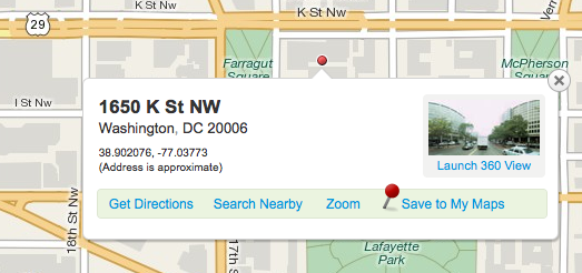
Most people stick with MapQuest because they trust their directions over others. After a couple of test searches, I prefer the directions from Google better. But MapQuest is more enjoyable to just browse around. One feature MapQuest did really well is right clicking anywhere on the map will bring up the address of that location. Sure the address is an approximation, but the map bubble that pops up gives the house number, street, city, and zip. Sometimes there is even a 360 degree view just like Google’s Street view. MapQuest’s street view feature is more basic but I find it more intuitive to pan around. It doesn’t take up the whole screen and its easy to just pop in, pop out and continue on your way.

Will I’ll drop Google Maps and make MapQuest my dedicated online mapping service? Probably not. Google Maps has too many extra features for a power user like me (auto complete, public transportation, scroll wheel to zoom in/out). But for those people that feel Google Maps is too complicated and  hard to use MapQuest provides a clean, easy to use mapping site that is geared for people like them. I would easily recommend MapQuest to an average computer user while Google is for people who want more features.

The more competition the better for all of us. MapQuest has certainly stepped up it’s game and I can’t wait to see what else they have in store.

Custom Clothing Makes A Comeback

CrunchGear recently opened my eyes to ShirtsMyWay.com, a site that lets anyone customize a dress shirt to their exact specifications. The minutia of details that one can pick and choose from is dizzying including the type of fabric; the design of the collar, cuffs, yoke, back, bottom, and pocket; type of buttons, button holes, collar stays, or a monogram; and, of course, the size of the shirt. Coming in at $75 per custom shirt at least, ShirtsMyWay.com is too rich for my blood. Besides, I’m not that great of a shirt designer.

But the site took me back to the days of the dotcom boom where I would spend hours on Customatix.com. The company was started by four Adidas executives in 2000 with the aim of letting anyone create a completely customized shoe. You could pick from a bunch of different styles, choose the colors of various pieces, have your name stitched on the back, pick the laces, and even add a logo from their huge library. I remember making a whole virtual closet full of shoe designs that I had no intention of actually purchasing. I guess that’s why they’re no longer around. Though I did get a friend a gift certificate to the site for her birthday and she did design and order her own custom-made shoes.

On the brighter side, it looks like Customatix inspired the wave of hideous MySpace profiles later in the decade.